Our decision to evolve the brand aligns with a pivotal moment in time for Pop Up Grocer, as a business. We're evolving—into new formats, as a team, with a real mission at hand—and thus it felt natural to take a moment to pause and ask ourselves if how we look on the outside reflects that growth/those changes.
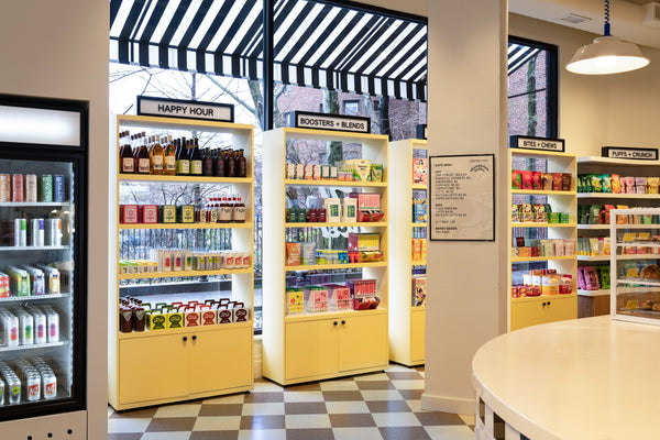
The new brand provides us with a more robust toolbox—fonts, colors, iconography—to implement across channels, which will allow us to create spaces, both physically and digitally, that provoke joy. We are, first and foremost, a space for discovery. We were in need of a few more tools to allow us to continuously stimulate and entertain.
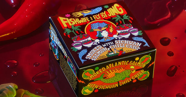
...enter, Gander! This creative agency is not only behind our new look, but so many of-the-moment DTC brands like Graza, Magic Spoon, Phil’s Finest & Banza. We hope this Q&A with Katie Levy brings you a smile, a head scratch, and a peek into the genius of this team.

How is Gander’s creative process different than other agencies?
Obviously I can only speak from personal experiences, but I think we’re generally more collaborative. It’s normal for someone to pick up another person’s files and iterate on something they see, or for a project to be touched by a few hands before it’s finalized. We consider our best work to be the result of a collective rather than of an individual. We also collaborate a lot with our clients.
We like to think of our brands as a great pair of pants. We’re of course going to design something that reflects our vision and hope that our instincts are trusted, but ultimately we want our clients to be able to wear them and feel comfortable with who they see in the mirror. If it feels like putting on a costume, we feel like we haven’t done our jobs properly.
What were the overall goals for the new PUG branding and visual identity?
There were so many! But our strategic process drove us toward a few key goals:
-
Consistently New: With the addition of the permanent location, we needed to capture the spirit of newness and discovery that was so important to the original PUG brand, while conveying that we’re not fleeting or temporary. When you’re always focused on what’s new/next, you lose out on the consistency that creates routines, relationships, and therefore community.
-
Destination: Grocery: Create a brand that toes the line between being monumental and everyday. Again, with both pop-ups and a permanent location sitting under one roof, we needed a brand that could flex between two very different experiences (and perhaps even different audiences). The experience should feel like a destination but also fit into the lives of the customers for whom PUG is a neighborhood staple.
- Platform for Discovery: PUG is meant to actively encourage people to explore, so we needed to create that backdrop for these new and unique products. PUG is here to change the grocery experience not only for shoppers but for emerging businesses as well, so we wanted to be a champion for our featured brands. This means creating an experience that leaves space for others to shine.
What is the design strategy/meaning behind the new PUG logo?
With the new wordmark, we wanted to communicate a sense of timelessness. We found inspiration from other neighborhood staples that serve communities and create a sense of permanence, trust and real human connection (think florists, funky hardware stores, a local wine shop, or even your corner bodega). Always reliable, always delightful.
Our team created a hand lettered logomark for PUG that was totally bespoke and meant to pay homage to the tradition of sign painting and old school shop lettering (especially in New York). We of course layered on our own contemporary twist, and the typography and color palette throughout also reinforces the brand idea.
You’ve built brands for some of the most-loved new companies in CPG (Graza, Magic Spoon, Phil’s Finest, Banza, etc). What do you think it takes for a CPG brand to stand out in 2022?
It’s really easy to feel simultaneously overwhelmed and delighted by the sheer number of brands that launch these days. What stands out to me is when I see a brand that has an obvious sense of purpose beyond product-market fit, and ideally is creating something that hasn’t been done (or done well) before. There’s a million better for you _______ these days (or my personal favorite, milk made from _______), and I think that the really notable brands go a few steps further. Beyond that, I think having interesting content is really important! It’s no longer enough that you have a great product, you should also have a newsletter that someone actually wants to subscribe to.
There’s a lot of nostalgia built into our brand and so many new brands today. What considerations go into designing a brand that is both nostalgic and timeless to last into the future?
I think long-lasting brands are a result of A) a strong connection between brand strategy and design, and B) a stellar product that people want. It’s so important that there is intentionality when referring to past (or even future) eras through design, and in an ideal world, the time period you’re referencing should feel relevant to your brand story or product. At the end of the day, the best way for a brand to avoid looking dated is to look less to what people around you are creating and focus on your own originality. Being yourself never goes outta style!
It’s 2032, how will CPG branding look different?
In 2032 I think most brands will be made from AI image generators. Just kidding, but hey you never know! Honestly I can’t really speculate about what branding will look like in 10 years, but my hope is that packaged goods as we know it will be more evolved. There will be far better alternatives to plastic and paper that don’t do so much harm to our planet. The companies themselves will shoulder this responsibility, rather than making consumers pay the price for better options. I also hope that over time people will invest more in local retail relationships and less on DTC, because maybe not everything needs to be delivered to your door.
The custom penny tile font you made for us is stunning. When it comes to fonts, we beg the question…serif of sans serif?
That’s an impossible question! How dare you! But ok, if I was on a deserted island and all I had was 1 style of typography to look at until I got saved, I guess I’d say serif. More diversity of style and expression! Then again if I was making a HELP sign for airplanes to find me…it would definitely have to be sans for legibility. I hope I never have to choose.

You helped us build a visual identity rooted in discovery and curiosity. How do you maintain a sense of wonder in your own life?
Nature is a big source of wonder in my life. Being connected to our planet is really awe-inspiring and always feeds my soul. As a New Yorker it can be hard to connect with that feeling, but for me that means going to city parks or gardens, beaches, and the Catskill mountains.
What’s your favorite part about grocery shopping?
What is not to love?? It’s one of my favorite pastimes (seriously don’t come shopping with me if you’re in a rush). I am a Park Slope Food Co-Op member and for me, shopping there is all about learning the seasons. Unlike most grocery stores, they don’t just have all the same fruit and veggies available year-round. You learn when it’s citrus (or peach or ramp or eggplant) season and you savor every moment. Also since I work in the food and bev world, shopping is an excuse to try a product I’ve never tasted before. Research, baby!